As a designer, you’ve probably read a book or two about typography and skimmed through hundreds of online articles. But how do you keep track of all the complex typography rules, tips and best practices that you’ve read over the years? To solve this problem, I’ve created the Flawless Typography Checklist.
Over a year in the making, this interactive checklist covers everything there is to know about typography. To create it, I read eight typography books and over two hundred articles, taking meticulous notes on every practical tip I could find. It includes everything I’ve learned from reviewing hundreds of typographic designs on Typewolf over the past three years. This is the most comprehensive resource on typography available—online or in print. Read it straight through as a complete master course or use it as a tool on every design project to guarantee your typography will always be flawless. Learn more…
Press 1–6 on your keyboard to jump between sections.
MMost websites have paragraph line lengths that are way too long to read comfortably. Probably the majority of sites I feature on Typewolf suffer from this problem. This is especially true on responsive designs where text reflows to match the viewport window.
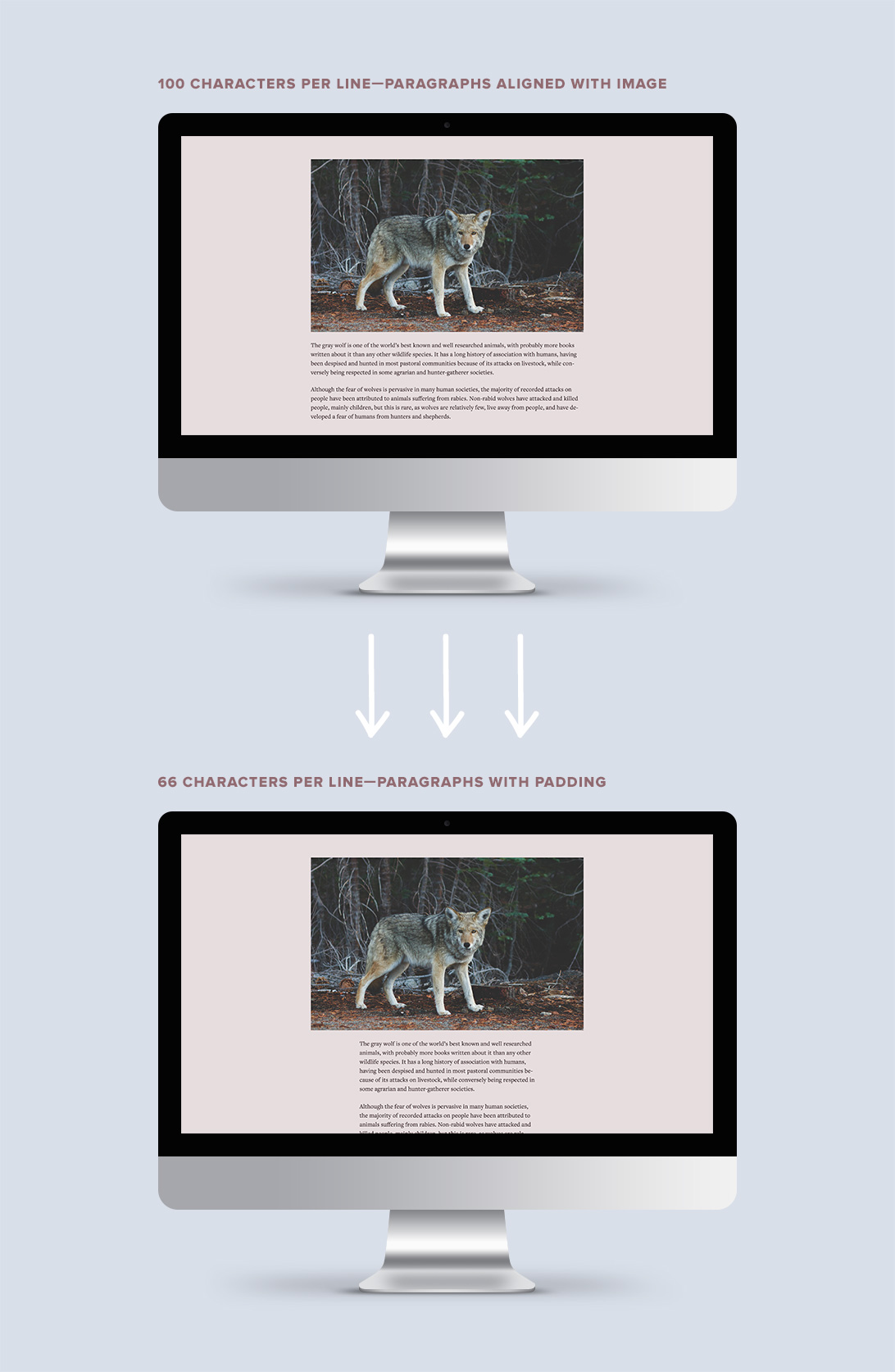
You should tweak your CSS at different breakpoints with the aim of keeping your line length under 75 characters. It’s not possible to have a perfect 66-character line at every screen width and that is totally fine. In my opinion, going slightly over 75 characters usually doesn’t pose too much of a problem. Reading really starts to degrade once you hit 100 characters per line and it’s not uncommon to see websites using 300+ characters per line. Wikipedia is a prime example—try reading an article on their site in a full-width browser window and you will quickly see how difficult it is for your eye to jump from one line to the next.
“The 66-character line (counting both letters and spaces) is widely regarded as ideal.” Robert Bringhurst, The Elements of Typographic Style
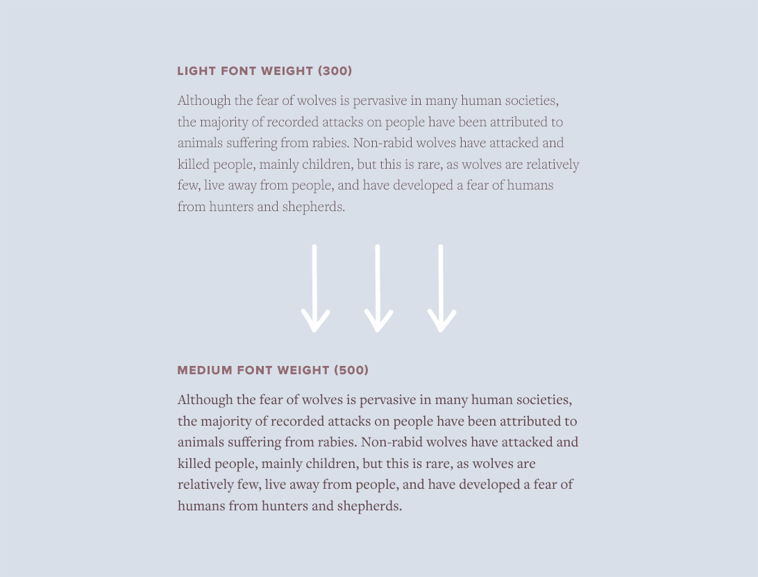
SSystem fonts typically are only available in regular and bold, however, Google Fonts has now made font families with a huge range of weights available to the masses. Source Sans Pro, Roboto, Open Sans, Raleway and Lato all come to mind. These days, it’s common to see websites using weights for body text, such as 100, 200 and 300, that were not designed with longform reading in mind.
The 100 weight of Roboto may look refined and delicate on your machine, but on other computers, it can be completely unreadable. Antialiasing varies from system to system and from browser to browser. On Retina screens especially, the lighter weights can appear very faint. A safe rule of thumb is to only set body text with regular, normal, book or, in some cases, medium. In CSS, this corresponds to a weight of 400 or 500.
This isn’t to say that 100, 200 and 300 weights aren’t useful—they certainly are, but not for setting body text. Use the lighter weights for headlines, lead paragraphs and other type set at large sizes.
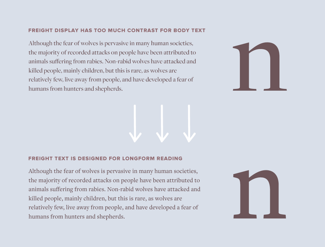
PPlayfair Display is a beautiful open-source typeface, but under no circumstances should it be used to set body text. Typefaces with Display in their name are designed specifically for display usage at large sizes. At body text sizes, they become extremely uncomfortable to read.
Display faces tend to have higher stroke contrast, tighter spacing and more intricate details, while text faces have simplified features, more even stroke contrast and looser spacing. Text faces are more boring but are comfortable to read. Display faces are designed to attract attention and create emotion, which isn’t what you want for longform reading.
“When searching for good options for long-form text, we need to recognize that we’re asking someone to live with this typeface for an extended period of time. Every eccentricity is amplified when used page after page.” Jason Santa Maria, On Web Typography
SSmall caps are capital letters that are specially designed to be used within running text. Their cap height is equal to (or a little taller than) the x-height of the lowercase letters. Small caps create a better reading experience compared to regular uppercase letters because they blend in and flow with the rest of the text. Regular uppercase letters jump out and yell, creating undue emphasis on words such as acronyms.
Pseudo small caps are fake small caps that are automatically generated by the browser. Real small caps aren’t simply capital letters that are scaled-down—instead, type designers create them from the ground up to match the weight and proportions of the lowercase. If you try to apply small caps to a font that doesn’t include them, ugly pseudo small caps will be the result.
Small caps are either built into font files as OpenType features or else included in a separate small caps font file. Loading a separate font file just to implement small caps may not be worth it on the web. I tend to only use OpenType small caps on my sites. This is the CSS code that I use (it will transform both lowercase and uppercase letters into proper small caps, which is usually what you want):
.small-caps {
    -moz-font-feature-settings: "c2sc", "smcp";
    -ms-font-feature-settings: "c2sc", "smcp";
    -webkit-font-feature-settings: "c2sc", "smcp";
    font-feature-settings: "c2sc", "smcp";
    letter-spacing: 0.05em;
}
“Software creates pseudo small caps by shrinking down normal caps to the approximate x-height; the resulting letters look starved and sickly because their weights don’t match that of their brethren.” Ellen Lupton, Type on Screen
font-feature-settings.<abbr> tag as the <acronym> tag is obsolete.font-variant: small-caps; will result in pseudo small caps if your font doesn’t include small caps; some older browsers will even override the proper OpenType small caps and replace them with pseudo small caps with this setting.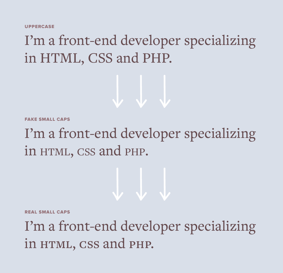
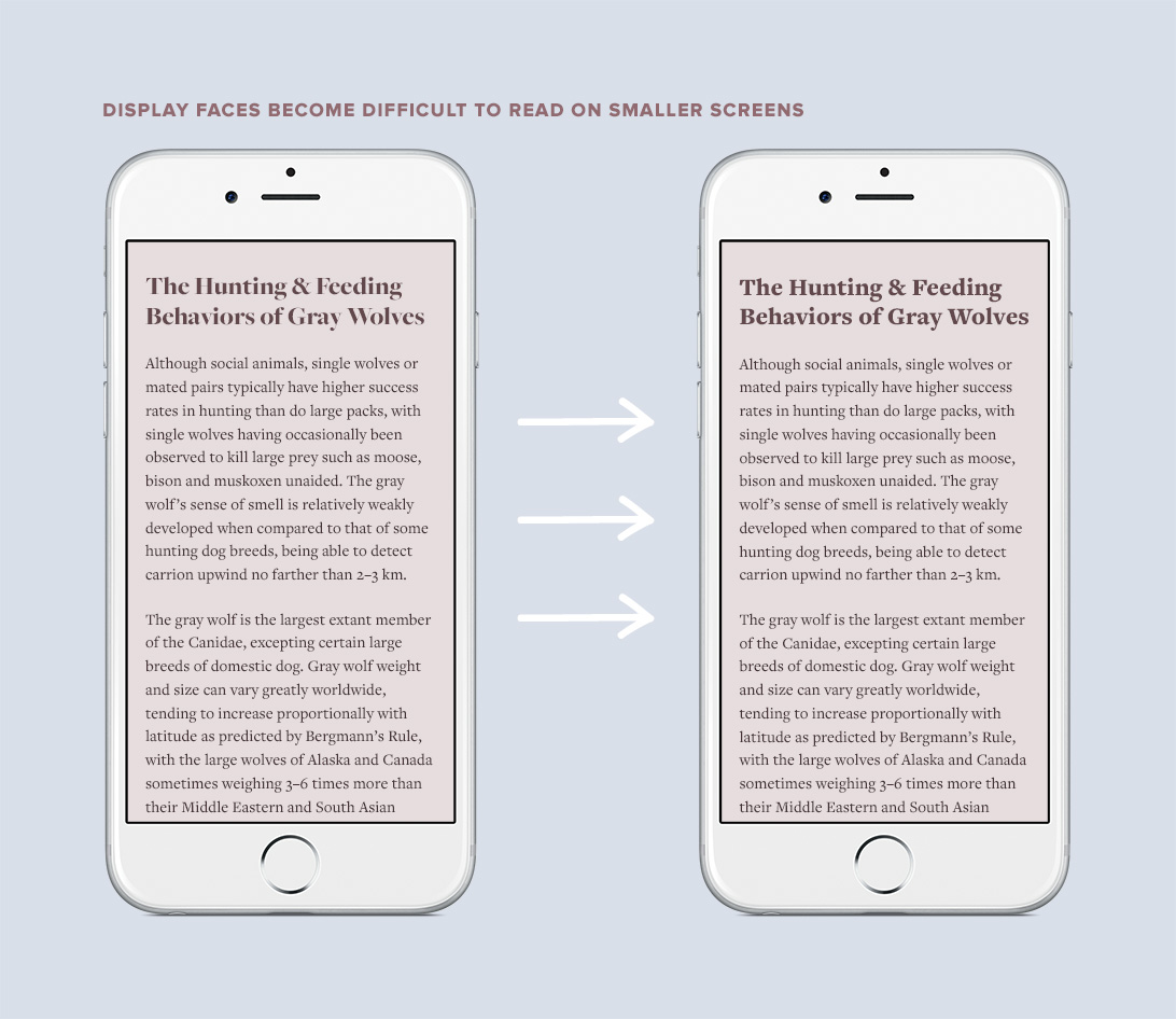
AA display face can look dramatic when set at a large size on desktop screens, however, when that same typeface is viewed on a smaller mobile screen, it can quickly become illegible. Display typefaces feature delicate strokes that appear elegant at large sizes but cause letters to break apart at small sizes.
If you are already loading both text and display versions of a webfont family, then there is no harm in swapping out the display version for the text version on mobile. In your CSS, simply use a media query to set the text version as the headline font family on small screens. Your mobile readers will thank you.
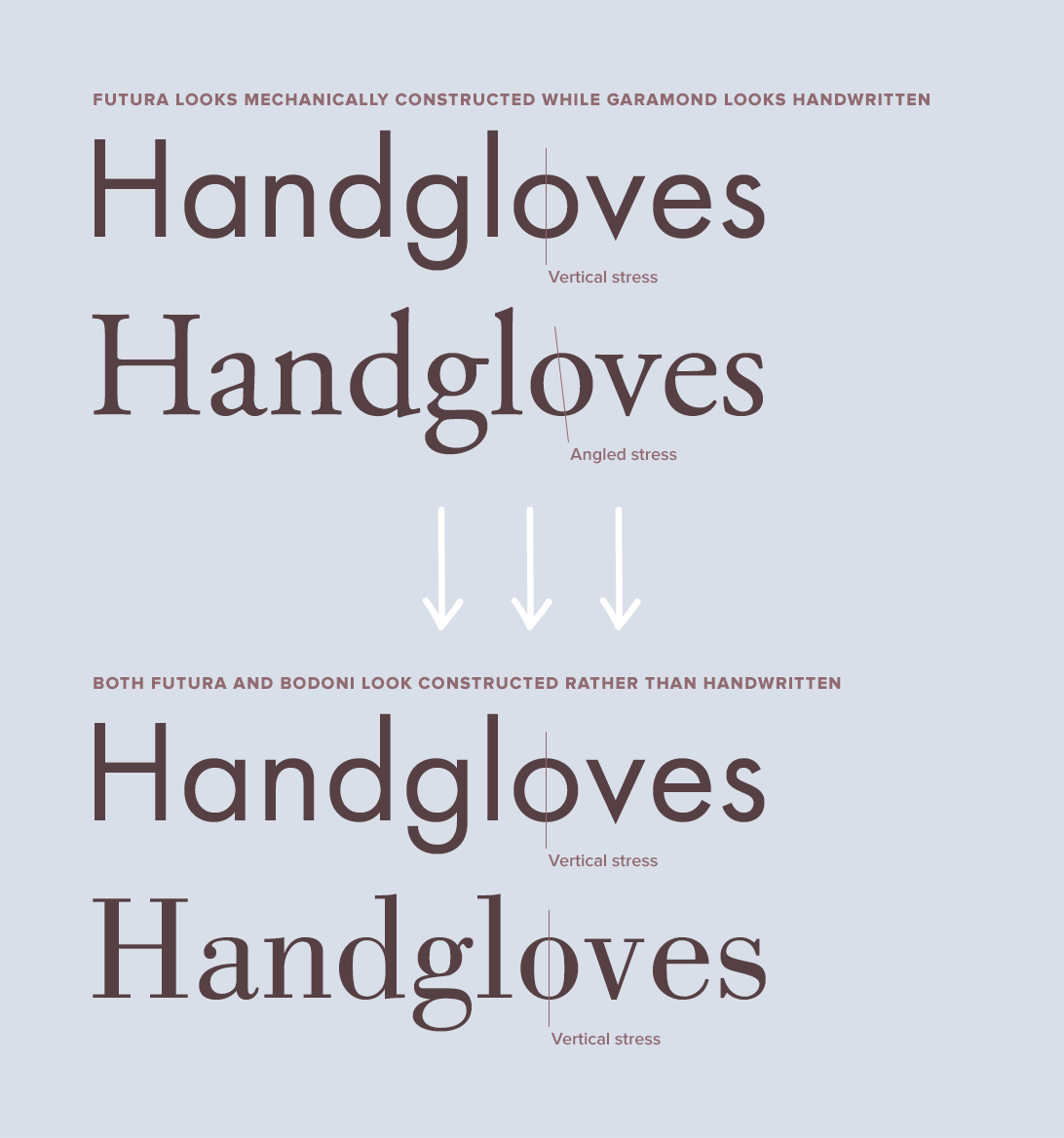
PPairing typefaces that “harmonize” isn’t super practical advice, so I wanted to go into a little more detail about what exactly that means. The easiest way to find harmony is to consider whether a typeface appears mechanically constructed or written by a human hand.
Futura and Bodoni are often mentioned in typography books as a classic pairing, so I will use those two typefaces in this example. But before we try pairing Futura with Bodoni, let’s try comparing Futura to Garamond…
Futura is a geometric sans-serif, so its forms are based off circles. It looks like someone constructed it using a protractor. Garamond, on the other hand, is a humanist serif and looks like someone drew it by hand. Garamond feels organic while Futura feels precise. The oval inside the o of Garamond sits at an angle, which mimics a hand holding a pen at an angle, while the o of Futura sits perfectly upright and straight. This angle is known as the stress of a typeface.
Let’s now compare Futura to Bodoni, which is a Modern or Rational serif. Notice how Bodoni has a perfectly vertical stress just like Futura. This vertical stress makes the letterforms appear exact and symmetrical. These shared characteristics reminiscent of mechanical construction create harmony between the two typefaces. Use this concept of constructed versus handwritten to guide you in finding harmonious pairings.
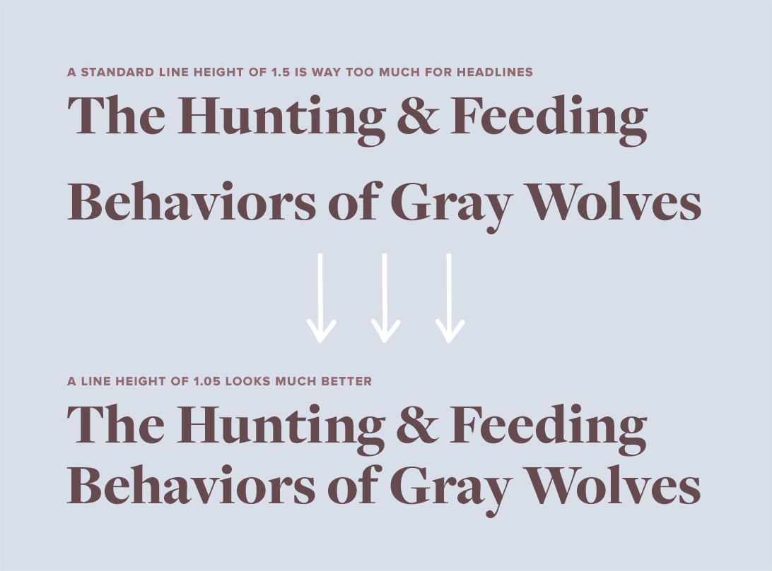
TThe standard line height of 1.5 is considered ideal for setting body text, however, for headlines and other large type, it is way too much. It’s common to see sites that use 1.5 across the board for all type, which leads to headlines with huge gaps between the lines.
The larger that type is set, the less of a line height it needs. Begin with a line height of 1.0 and work your way up from there until your headlines look good. There shouldn’t be a large gap between lines but neither should the spacing be so tight that the ascenders and descenders touch.
“A short burst of advertising copy or a title might be set with negative leading, so long as the ascenders and descenders don’t collide.” Robert Bringhurst, The Elements of Typographic Style
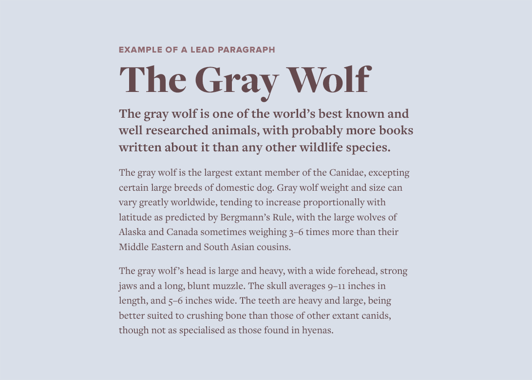
AA lead paragraph is a short paragraph set in a larger font size that opens an article. The purpose of a lead paragraph is to give the reader a quick summary of the story and provide a hook to entice further reading.
Lead paragraphs are useful on the web, as they give readers a bite-sized overview that is easily shareable. It’s common for people to share articles without fully reading them, so a lead can be helpful for those in a hurry. Stylistically, leads are usually set in a larger font size or given a different type treatment, such as bold or italic, to make them contrast with the paragraphs that follow.